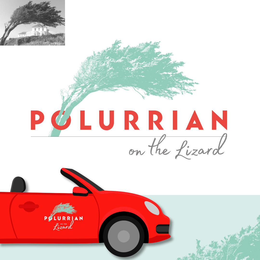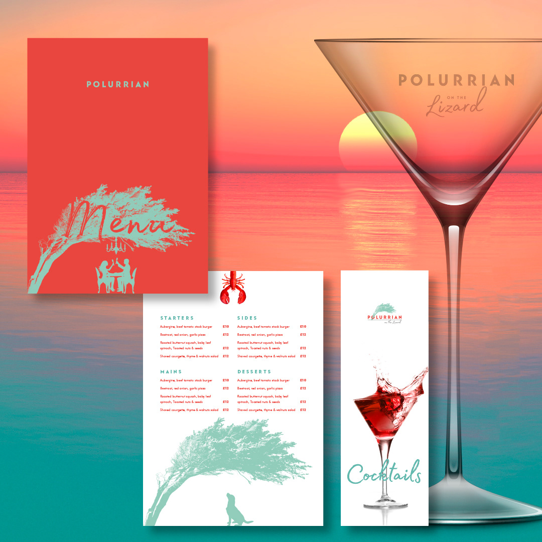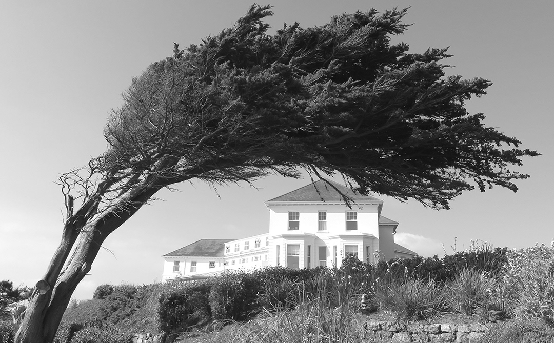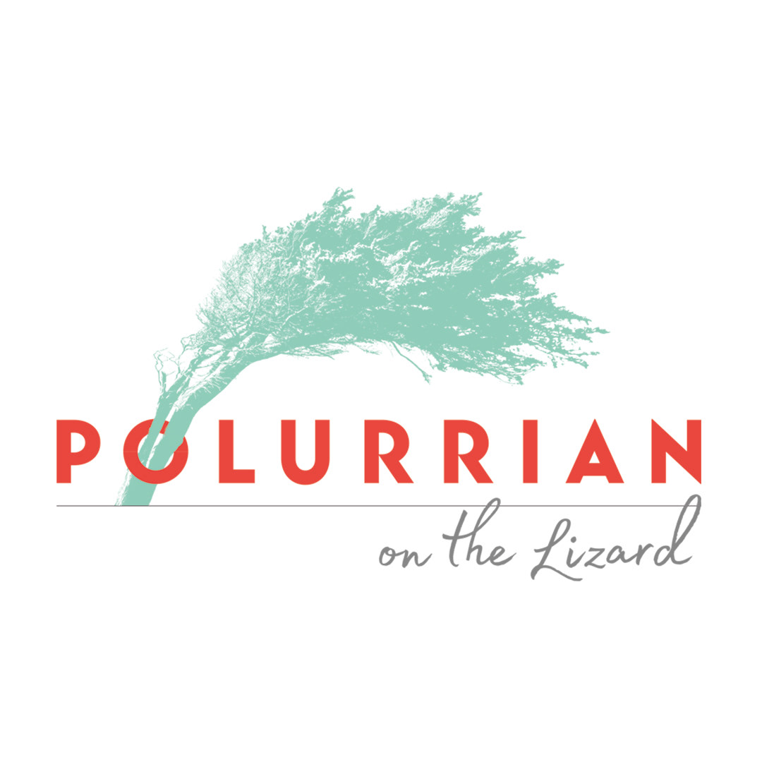


The Polurrian's own weathered pine tree, with it's distinctive italic 'P' shape, becomes an iconic motif, linking the hotel to its unique coastal location on the Lizard peninsula in South Cornwall.
The art deco style sans serif font is inspired by the classic railway travel posters, which invited Victorian tourists to the Lizard.
The hand lettering represents the personal touch; the embodiment of luxury.
Our core colours are warm red, inspired by the amazing Polurrian sunsets, and
a nod towards the Serpentine rock found only in the Lizard peninsula. And, cool turquoise, representing the bluey green hues of the idyllic coastal location.
a nod towards the Serpentine rock found only in the Lizard peninsula. And, cool turquoise, representing the bluey green hues of the idyllic coastal location.
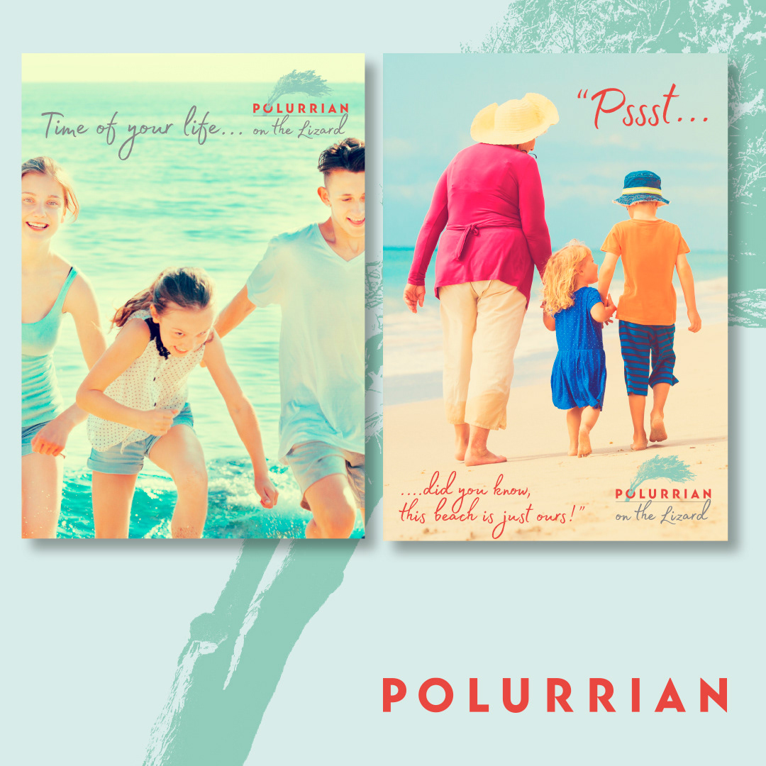
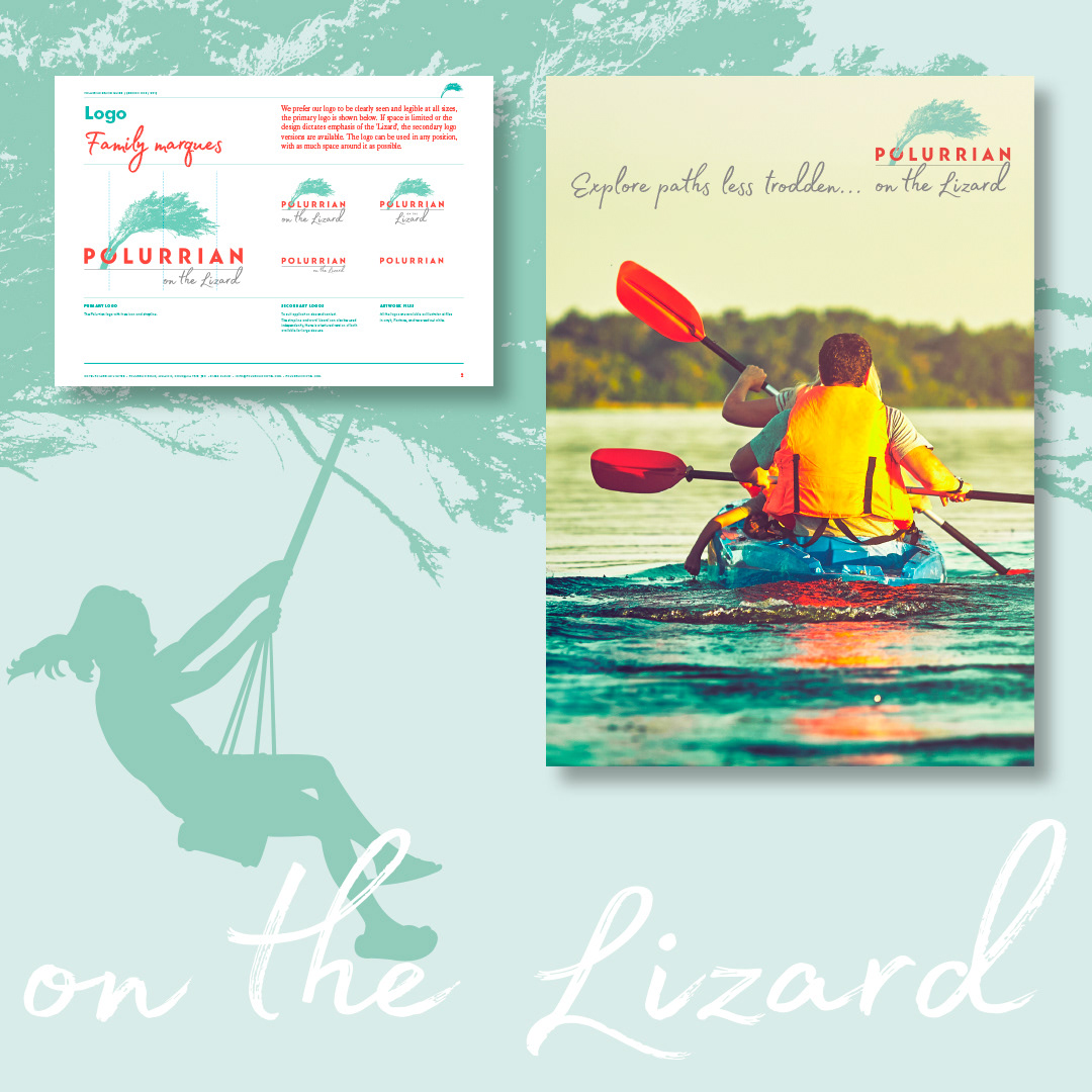
Our 'tree stories' show how the tree icon can be used to frame a scene or character, developing a visual language that symbolically communicates Polurrian.
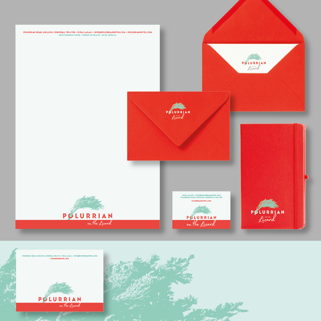
Scope: Brand strategy & repositioning, brand identity, stationery, brand toolkit